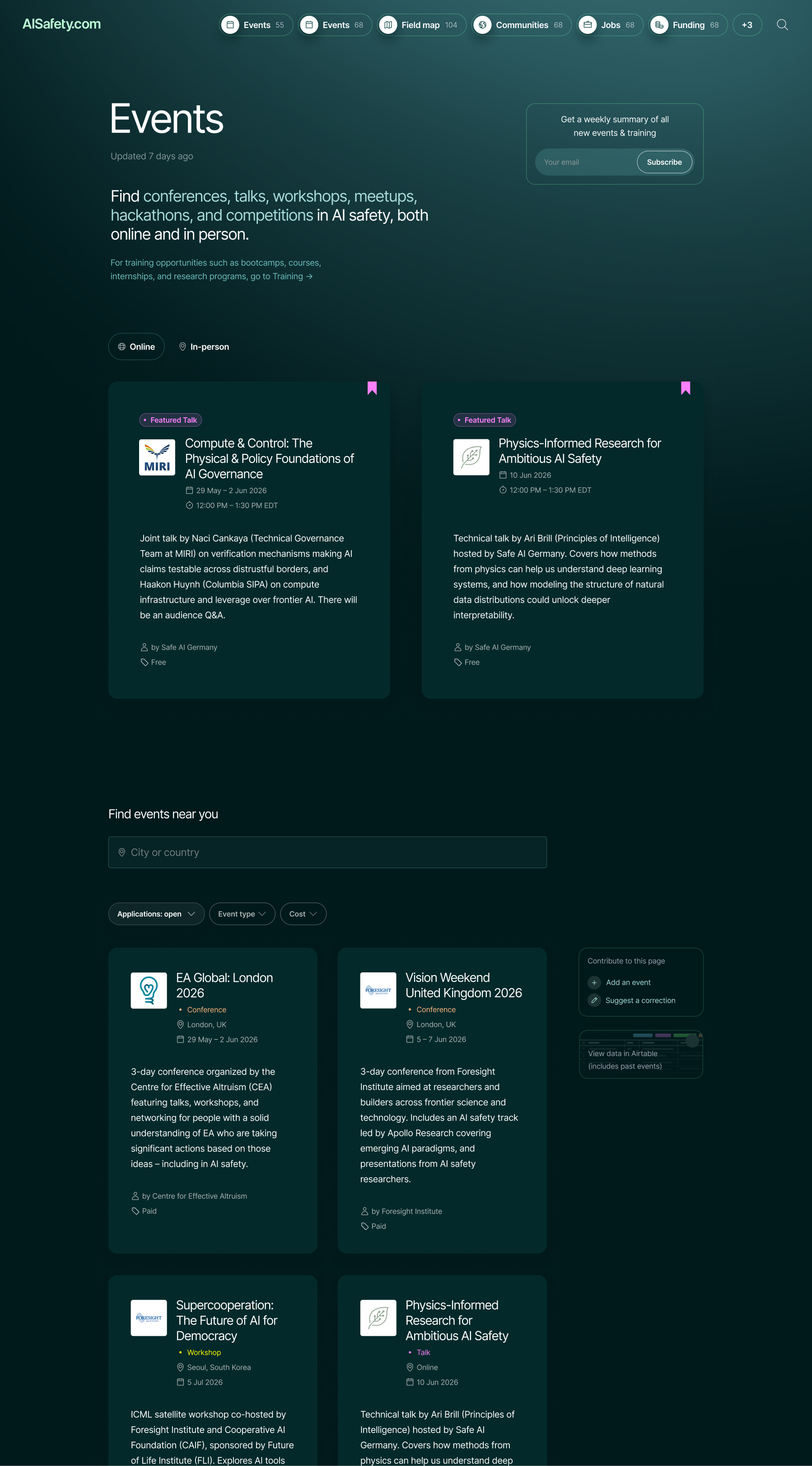
redesign & development of key signposting page
/events-and-training is the most visited page on AISafety.com, and a vital resource for signposting people interested in the field. I led user research & a redesign of the page with Melissa's guidance. I'm currently building the new /events page using Claude Code, while Melissa handles /training.
collaborators
Melissa Samworth
Designer / front-end developer
Bryce Robertson
Product manager
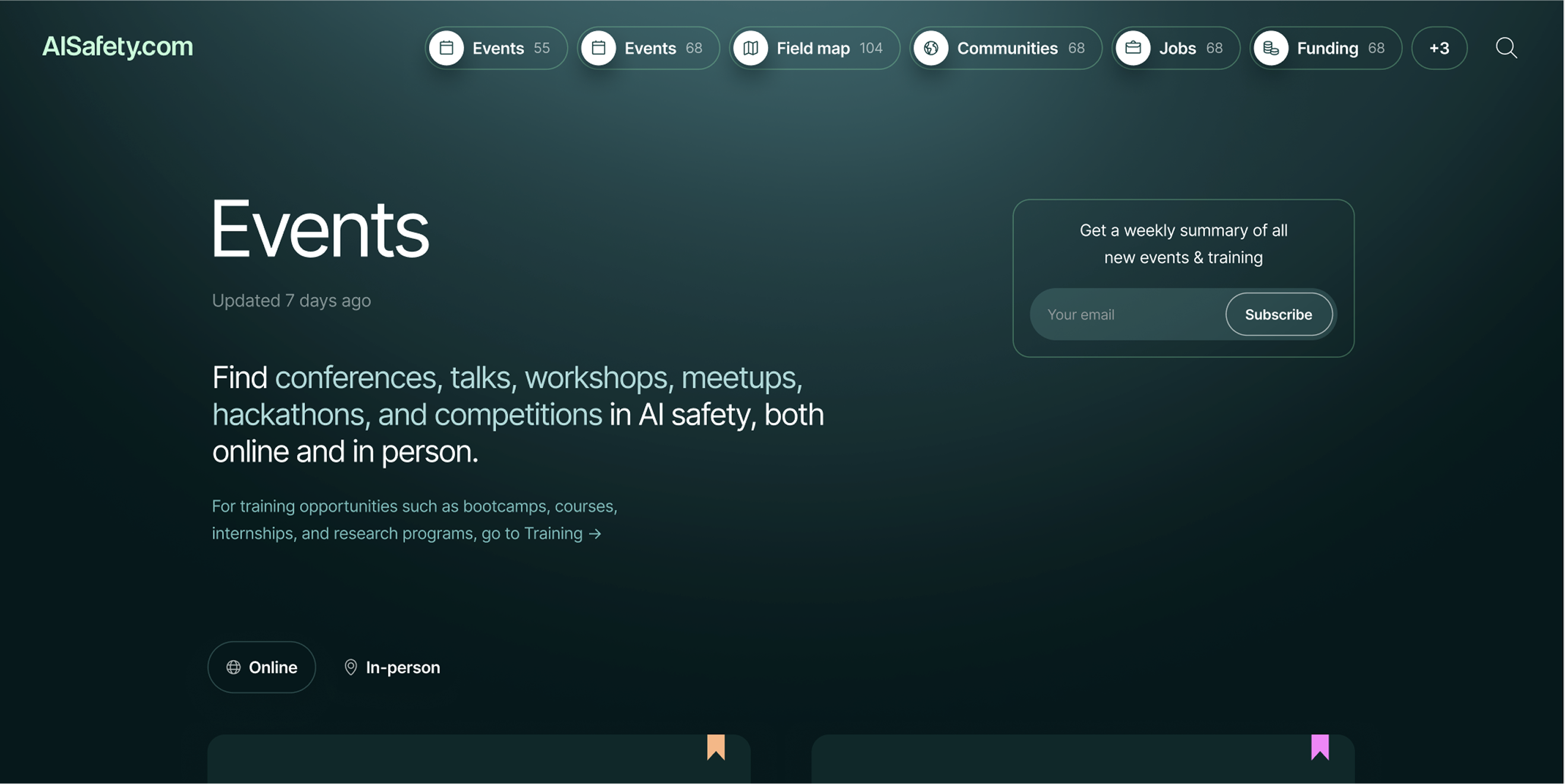
Redesigned /events page, soon to be live on AISafety.com/events. Credits for the visual design of this site go to Melissa Samworth.